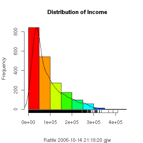
A histogram provides a quick and useful
graphical view of the spread of the data. A histogram plot in
Rattle includes three components. The first of these is obviously
the coloured vertical bars. The continuous data in the example here
(Distribution of Income) has been partitioned into ranges, and the
frequency of each range is displayed as the bar. R is
automatically choosing both the partitioning and how the x-axis is
labelled here, showing x-axis points at 0, 10,000 (using scientific
notation of  which means
  , or 10,000), and so on. Thus,
we can see that the most frequent range of values is in the
, or 10,000), and so on. Thus,
we can see that the most frequent range of values is in the  partition. However, each partition spans quite a large range (a range
of $5,000).
partition. However, each partition spans quite a large range (a range
of $5,000).
The plot also includes a line plot showing the so called
density estimate
and is a more accurate display of the actual (at least estimated true)
distribution of the data (the values of Income). It allows
us to see that rather than values in the range occurring
frequently, in fact there is a much smaller range (perhaps
 ) that occurs very frequently.
The third element of the plot is the so called rug
along the bottom of the plot. The rug is a single dimension plot of
the data along the number line. It is useful in seeing exactly where
data points actually lay. For large collections of data with a
relatively even spread of values the rug ends up being quite black, as
is the case here, up to about $25,000. Above about $35,000 we can
see that there is only a splattering of entities with such values. In
fact, from the Summary option, using the Describe check
box, we can see that the highest values are actually $36,1092.60,
$38,0018.10, $39,1436.70, $40,4420.70, and $42,1362.70.
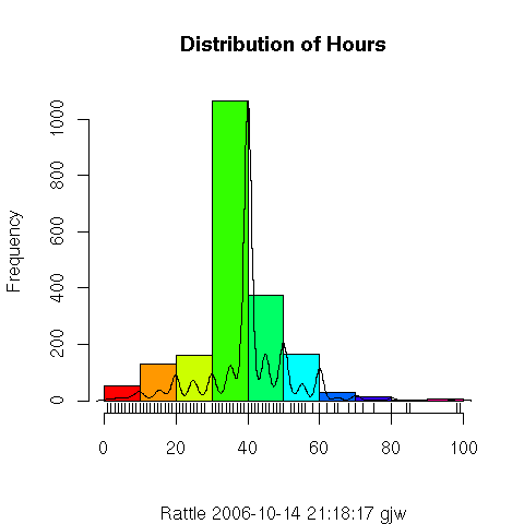
This second plot, showing the distribution for the variable
Hours, illustrates a more
normal
distribution. It is, roughly speaking,
a distribution with a peak in the middle and diminishing on both
sides, with regards the frequency. The density plot shows that it is
not a very strong normal distribution, and the rug plot indicates that
the data take on very distinct values (i.e., one would suggest that
they are integer values, as is confirmed through viewing the textual
summaries in the Summary option).
Copyright © Togaware Pty Ltd
Support further development through the purchase of the PDF version of the book.
The PDF version is a formatted comprehensive draft book (with over 800 pages).
Brought to you by Togaware. This page generated: Sunday, 22 August 2010