
Desktop Survival Guide
by Graham Williams
|
|
DATA MINING
Desktop Survival Guide by Graham Williams |
|
|||
|


|
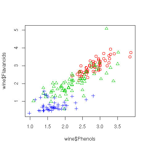
A scatterplot presents points in 2-dimensional space corresponding to a pair of chosen variables. R's plot function defaults to a scatterplot. Relationships between pairs of variables can be seen through the use of a scatterplot and clusters and outliers can begin to be identified.
Using the wine dataset a plot is created to display Phenols versus Flavanoids. To add a little more interest to the plot, a different symbol (and for colour devices, a different colour) is used to display the three different values of Type for each point. The symbols are set using Type as the argument to Roption[]pch, but after converting it to integers with as.integer. In a similar fashion, the colours are chosen to replace numbers in a transformation of the Type vector by indexing into the output of palette, achieved using lapply, and turning the result into a flat list, rather than a list of lists, using unlist.
We can start to understand that there is somewhat of a linear
relationship between these two variables, and even more interesting is
the clustering of Types.
iType <- as.integer(wine$Type)
colours <- unlist(lapply(iType, function(x){palette()[x+1]}))
plot(wine$Phenols, wine$Flavanoids, col=colours, pch=iType)
dev.off()
|