Desktop Survival Guide
by Graham Williams


|
DATA MINING
Desktop Survival Guide by Graham Williams |

|
|||

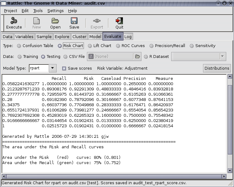
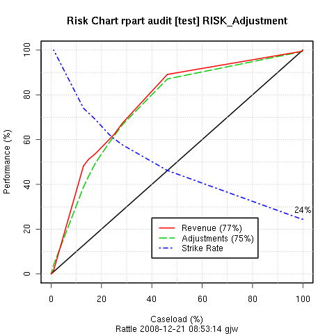
We have introduced the idea of a Risk Chart to communicate the effectiveness of a model when each entity has associated with it a risk value. For example, for revenue (or tax) authorities, the outcomes of audits include a dollar amount by which the tax obligation of the taxpayer has been changed (which may be a change in favour of the revenue authority or in favour of the taxpayer). For fraud investigations, the outcome might be the dollar amount recovered from the fraud. It is often useful to see the tradeoff between the return on investment and the number of cases investigated.

For example, we might choose a cutoff to be a probability of 0.28 so that anything predicted to be in class 1 with a probability of 0.28 or more will be regarded as in class 1. Then the number of predicted positives (or the Caseload) will be 30% (0.301667) of all cases. Amongst this 30% of cases are 69% of all true positives and they account for 79% of the total of the risk scores. The strike rate (number of true positives amongst the positives predicted by the model) is 61%. Finally, the measure reports the sum of the distances of the risk and recall from the baseline (the diagonal line). This measure can indicate the optimal caseload in terms of maximising both risk recovery and recall.
Copyright © Graham.Williams.com Support further development through the purchase of the PDF version of the book.