Desktop Survival Guide
by Graham Williams


|
DATA MINING
Desktop Survival Guide by Graham Williams |

|
|||
Other Plots |
The Display menu provides a number of other options for plots.
The Scatterplot Matrix, for example, can be used to display a matrix of scatterplots across many variables at the one time. We've seen this already in both Rattle itself and in latticist. GGobi offers brushing and linkage to all of the other currently displayed GGobi plots.
By default, the first four variables are displayed, as illustrated here. We can add and remove variables by selecting the appropriate buttons in the control window. Any manual or automatic brushing in effect will also be reflected in the scatterplots, as we see in Figure 7.10.
A parallel coordinates plot is also easily generated from GGobi's Display menu. An example can be seen in Figure 7.11, showing five variables, beginning with Sunshine. The automatic brushing based on Sunshine is still in effect and we can see that the coloured lines emanate from the left end of the plot within colour groups. The yellow lines represent observations with a higher value of Sunshine and we can see that these generally correspond with higher values of the other variables here, except for the last (Rainfall).
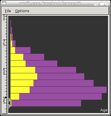
Todo: Include bar chart plus the interactive binning.
Todo: The following is under development.

The thing to note here is the two arrows down the bottom left side of the plot. Drag these around to get different width bars.
A scatterplot over very many points will sometimes be solid black and shows little useful information. In these cases a bagplot may be useful.
Copyright © Togaware Pty Ltd Support further development through the purchase of the PDF version of the book.