
Desktop Survival Guide
by Graham Williams
|
|
DATA MINING
Desktop Survival Guide by Graham Williams |
|
|||
Map Displays |


|
Map displays often provide further insights into patterns that vary according to region. In this plot we illustrate some basic colouring of a map. This can be used to translate a variable into a colour which is then plot for the state. We use the rainbow function to generate the bright colours to use to colour the states.
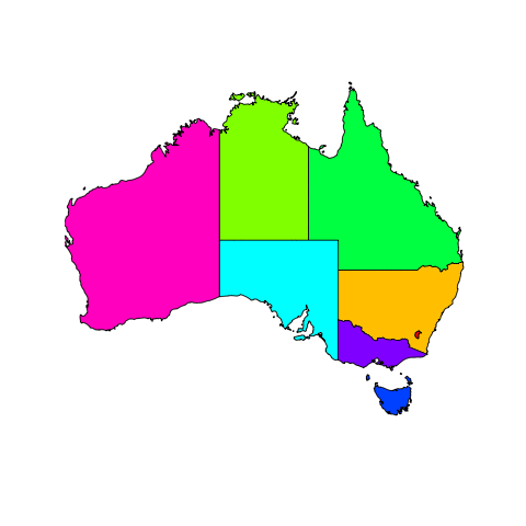
library(maptools)
aus <- readShapePoly("australia.shp")
plot(aus, lwd=2, border="grey", xlim=c(115,155), ylim=c(-35,-20))
colours <- rainbow(8)
# Must be a better way than this....
nsw <- aus; nsw@plotOrder <- as.integer(c(2)); plot(nsw,col=colours[2],add=TRUE)
act <- aus; act@plotOrder <- as.integer(c(1)); plot(act,col=colours[1],add=TRUE)
nt  <- aus; nt@plotOrder  <- as.integer(c(3)); plot(nt, col=colours[3],add=TRUE)
qld <- aus; qld@plotOrder <- as.integer(c(4)); plot(qld,col=colours[4],add=TRUE)
sa  <- aus; sa@plotOrder  <- as.integer(c(5)); plot(sa, col=colours[5],add=TRUE)
tas <- aus; tas@plotOrder <- as.integer(c(6)); plot(tas,col=colours[6],add=TRUE)
vic <- aus; vic@plotOrder <- as.integer(c(7)); plot(vic,col=colours[7],add=TRUE)
|
Here's a great example using the ggplot2 package, based on examples from http://www.thisisthegreenroom.com/2009/choropleths-in-r/. These plots are called choropleths.
> library(ggplot2)
> library(maps)
> # Dowload and clean up the data to plot
>
> # unemp <- read.csv("http://datasets.flowingdata.com/unemployment09.csv")
> unemp <- read.csv("unemployment09.csv")
> unemp_data$counties <- tolower(paste(states,counties,sep=","))
> countyNames <- sapply(as.character(unemp_data$CountyName),strsplit,", ")
> counties <- sapply(countyNames ,"[",1)
> states <- sapply(countyNames ,"[",2)
> states <- as.character(stateAbbr[states,2])
> #parse out county titles & specifics
> unemp_data$counties <- sub(" county","",unemp_data$counties)
> unemp_data$counties <- sub(" parish","",unemp_data$counties)
> unemp_data$counties <- sub(" borough","",unemp_data$counties)
> unemp_data$counties <- sub("miami-dade","dade",unemp_data$counties)
> #define color buckets
> colors = c("#F1EEF6", "#D4B9DA", "#C994C7", "#DF65B0", "#DD1C77", "#980043")
> unemp_data$colorBuckets <- as.factor(as.numeric(cut(unemp_data$unemp,c(0,2,4,6,8,10,100))))
> # Extract the reference data
>
> mapcounties <- map_data("county")
> mapstates <- map_data("state")
> # Merge the data with ggplot county coordinates
>
> mapcounties$county <- with(mapcounties , paste(region, subregion, sep = ","))
> mergedata <- merge(mapcounties, unemp, by.x = "county", by.y = "counties")
> mergedata <- mergedata[order(mergedata$order),]
> #draw map
> map <- ggplot(mergedata, aes(long,lat,group=group)) + geom_polygon(aes(fill=colorBuckets))
> map <- map + scale_fill_brewer(palette="PuRd") + coord_map(project="globular") + opts(legend.position = "none")
> #add state borders
> map <- map + geom_path(data = mapstates, colour = "white", size = .75)
> #add county borders
> map <- map + geom_path(data = mapcounties, colour = "white", size = .5, alpha = .1)
> map
|