Desktop Survival Guide
by Graham Williams
|
|
DATA MINING
Desktop Survival Guide by Graham Williams |
|
|||
Understanding Our Data |


|
We have reviewed the modelling part of data mining above with very little attention to the data. Any realistic data mining project, though, will precede modelling with quite an extensive exploration of data, in addition to understanding the business, understanding what data is available, and transforming that data into a form suitable for modelling. There is a lot more involved than just building a model.
Rattle's Explore tab provides some basic plots as well as extensive data exploration through the extra latticist and rggobi packages. Whilst we will cover exploratory data analysis in detail in Chapter 6, we present here an initial flavour, in the interest of getting started.
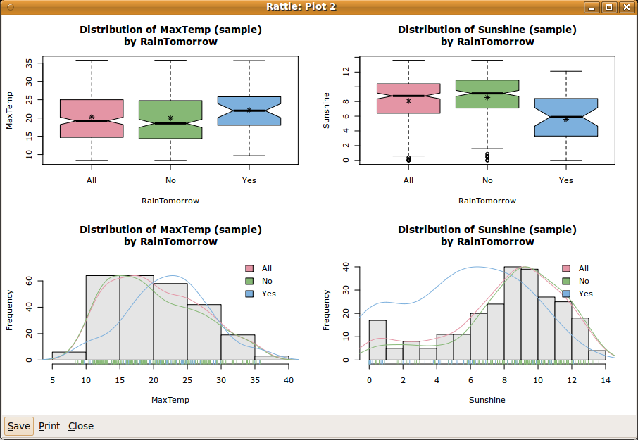
Figure 2.6 shows a simple plot of our data, with four subplots. We can display this plot from the Explore tab by selecting the Distributions option. Under both the Box Plot and Histogram columns select MaxTemp and Sunshine. Then click on Execute to display the same plot as in Figure 2.6.
The plots begin to tell a story about the data. We sketch the story here, but there is much more in Chapter 6.
The top two plots are known as box and whisker plots. The top left plot tells us that the maximum temperature is generally higher the day before it rains (the plot above the x axis labelled ``Yes'') than before the days when it does not rain (above the ``No'').
The top right plot suggests an even more skewed distribution for the amount of sunshine the day prior to the prediction. Generally we see that if there is less sunshine the day before, then the chances of rain seem to be increased.
The bottom plots each overlay three separate plots that give further insight into the distribution of the observations. The three plots within each figure are a histogram (bars), a density plot (lines), and a rug plot (short spikes on the x axis).
The histogram has partitioned the numeric data into equal width segments, showing the frequency for each segment. We see again that sunshine (the bottom right) is more skewed than the maximum temperature.
The density plots tend to convey a more accurate picture of the distribution of the data. Because the density plot is a simple line, we can also display the density plots for each of the target classes (Yes and No).
Along the x axis is the rug plot. The short vertical lines represent actual observations. This can give us an idea of where any extreme values are, and the dense parts show where more of the observations lay. With a categoric target variable identified we can also colour the threads of the rug, giving yet another clue as to any differences in the distributions of the data with respect to the target variable values.
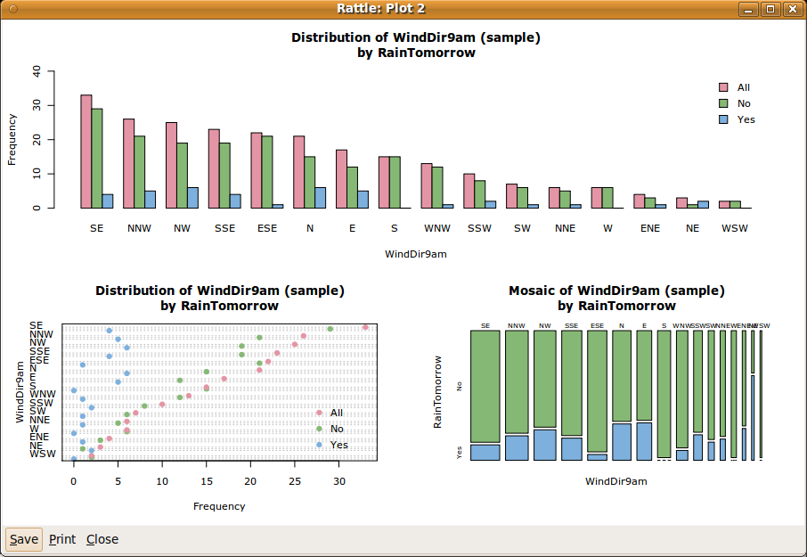
These plots are useful in understanding the distribution of the numeric data. Rattle similarly provides a number of simple standard plots for categoric variables. A selection is shown in Figure 2.7. All three plots show a different view of the one variable, WindDir9am.
gdata: read.xls support for 'XLS' (Excel 97-2004) gdata: files ENABLED. gdata: read.xls support for 'XLSX' (Excel 2007+) gdata: files ENABLED. |
The top plot shows a very simple bar chart, with bars corresponding to each of the levels (or values) of the categoric variable of interest (WindDir9am). The bar chart has been sorted from the overall most frequent to the overall least frequent categoric value. We note that each value of the variable (e.g., the value ``SE'', representing a wind direction of south-east) has three bars. The first bar is the overall frequency (i.e., the number of days) for which the wind direction at 9am was from the south-east. The second and third bars show the breakdown for the values across the respective values of the categoric target variable (i.e., for No and Yes). We can see that the distribution within each wind direction differs between the three groups. Recall that the three groups correspond to all observations (All), observations where it did not rain on the following day (No), and observations where it did (Yes).
The lower two plots show essentially the same information, in different forms. The bottom left plot is a dot plot. It is similar to the bar chart, on its side, and with dots representing the ``top'' of the bars. The breakdown into the levels of the target variable is compactly shown as dots within the same row.
The bottom right plot is a mosaic plot, with all bars having the same height. The relative frequencies between the values of WindDir9am are now indicated by the width of the bars. Thus ``SE'' is the widest bar, and ``WSW'' is the thinnest. The proportion between No and Yes within each bar is clearly shown. A mosaic plot allows us to easily identify levels which have very different proportions associated with the levels of the target variable. We can see that a north wind direction has a higher proportion of observations where it rains the following day. That is, if there is a northerly wind today, then the chance of rain tomorrow seems to be increased.
Data visualisation, also referred to as exploratory data analysis, is a powerful tool for understanding our data. We actually learn quite a lot about our data through this approach, even before we start to specifically model the data. Many data miners begin delivering significant benefit to their clients simply by providing such insights. We delve further into exploring data in Chapter 6.