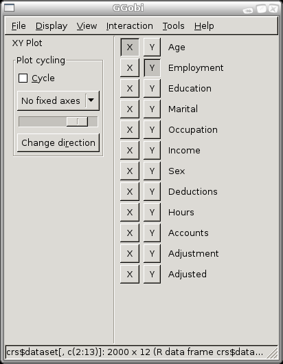
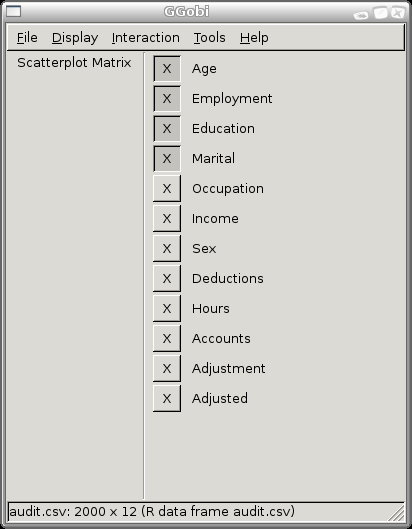
When you startup GGobi (Execute the GGobi option) two
windows will appear: one to control the visualisations and the other
to display the default visualisation (a two variable scatterplot). The
control window is as displayed to the right. It is a basic window with
menus that provide the overall control of the visualisations. Below
the menu bar you will see XY Plot which tells us that we are
displaying a two variable scatterplot. On the right hand side is a
list of the variables from your dataset, togther with buttons to
choose which variable to plot as the X and the Y. By
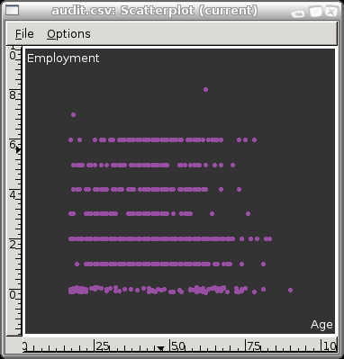
default, the first (Age) and second
(Employment) are chosen. You can choose any of your
variables to be the X or the Y by clicking the
appropriate button. This will change what is displayed in the plot.
From the Display menu you can choose a New Scatterplot Display so that
you can have two (or more) plots displayed at a time. At any one time
just one plot is the current plot (as indicated in the title) and you
can make a plot current by clicking in it.
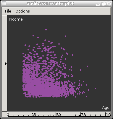
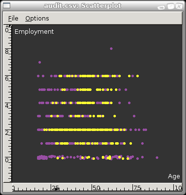
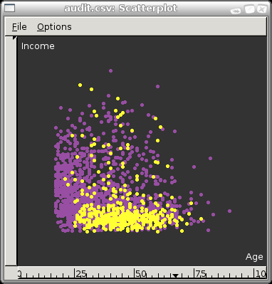
For our purposes we are usually most interested in the relationship
between the values of the variables for entities that have an
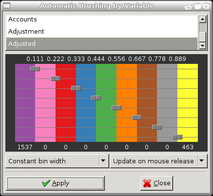
Adjusted value of 1 or 0. We can have these highlighted
in different colours very easily. From the Tools menu choose Automatic
Brushing. From the variables list at the top of the resulting popup
window choose Adjusted. Now click on the Apply button and
you will see that the 1,537 points that have a value of 0 for
Adjusted remain purple, whilst those 463 entities that
have a value of 1 are now yellow. This will apply to all displayed
plots.
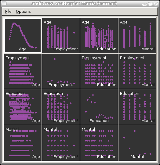
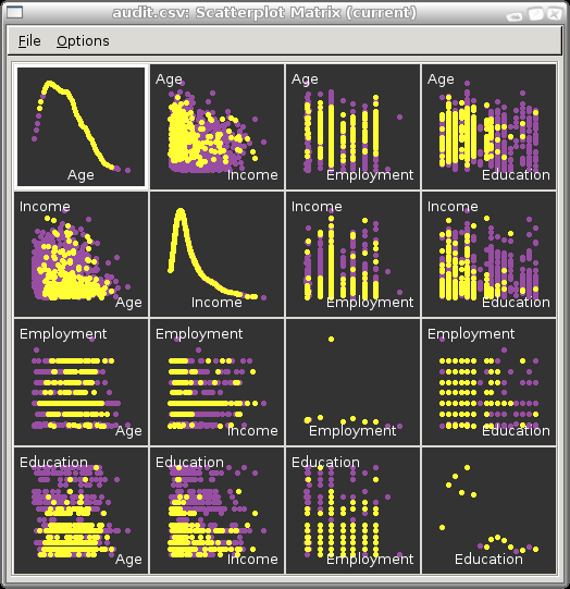
The Display menu provides a number of other options. The Scatterplot
Matrix, for example, can be used to display a matrix of scatterplots
across many variables at the one time. By default, the first four
variables are displayed, as illustrated here, but we can add and
remove variables by selecting the appropriate buttons in the control
window (which is now displaying only the choice of X
variables. You can also use the Automatic Brushing that we
illustrated above to highlight the adjusted cases. Such matrix
scatterplots are effective in providing an overview of the
distributions of our data.
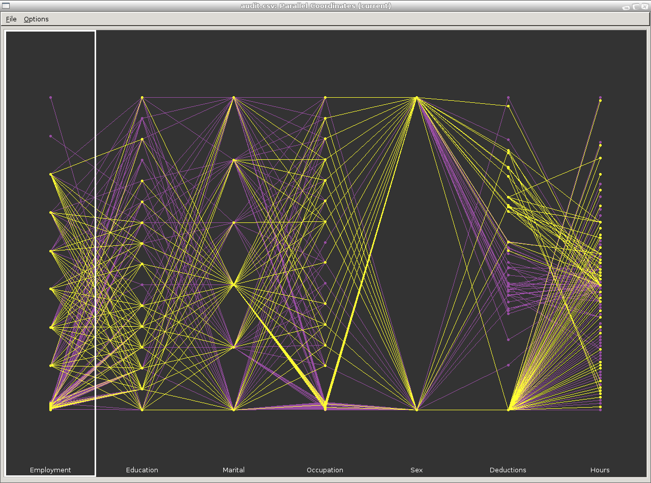
INCLUDE PARALLEL COORDINATES
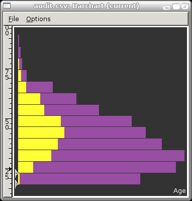
INCLUDE BAR CHART PLUS THE INTERACTIVE BINNING
The thing to note here is the two arrows down the bottom left side of
the plot. Drag these around to get different width bars.
A scatterplot over very many points will sometimes be solid black and
shows little useful information. In these cases a bagplot may be
useful.
Copyright © Togaware Pty Ltd
Support further development through the purchase of the PDF version of the book.
The PDF version is a formatted comprehensive draft book (with over 800 pages).
Brought to you by Togaware. This page generated: Sunday, 22 August 2010