
Desktop Survival Guide
by Graham Williams
|
|
DATA MINING
Desktop Survival Guide by Graham Williams |
|
|||
Line and Point Plots |


|
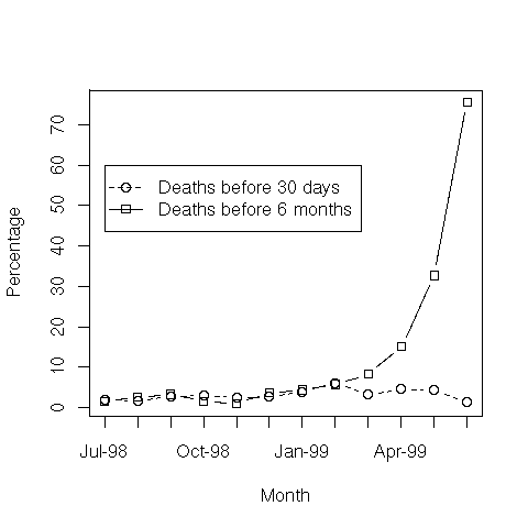
A dot plot can be extended to draw lines between the dots! We use a
simple dot plot to compare two sets of data. The points record
(fictional) percentages of patients recorded as dying within 30 days
and within 6 months of some procedure. Once again, a plot is first
created for death6m. In this case we have both points and
lines (type="b"), solid lines are used (lty=1), and
a small square is used to plot points (pch=0). The rest of
the plot is then constructed by adding a plot for death30,
adding a box around the plot, and adding two axes and a legend.
pdf('graphics/rplot-dot.pdf')
  dates <- c('Jul-98', 'Aug-98', 'Sep-98', 'Oct-98', 'Nov-98', 'Dec-98',
             'Jan-99', 'Feb-99', 'Mar-99', 'Apr-99', 'May-99', 'Jun-99')
  death30 <- c(2.02, 1.53, 2.73, 3.09, 2.37, 2.60,
               3.87, 6.11, 3.23, 4.52, 4.27, 1.40)
  death6m <- c(1.52, 2.55, 3.28, 1.55, 0.95, 3.65,
               4.42, 5.68, 8.29, 15.08, 32.70, 75.52)
  plot(death6m, type='b', xlab='Month', ylab='Percentage',
       lty=1, pch=0, axes=FALSE)
  lines(death30, type='b', lty=2, pch=1)
  box()
  axis(1, at=seq(1, length(dates)), labels=dates)
  axis(2, at=seq(0, 100, 10))
  legend(1, 60, c('Deaths before 30 days', 'Deaths before 6 months'),
         lty=c(2, 1), pch=c(1, 0))
dev.off()
|